The Website Made Me Do It
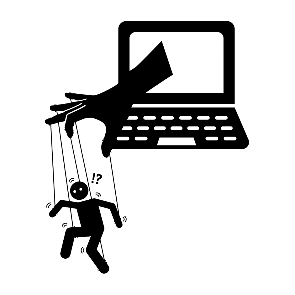
Have you ever gone onto a website just to “look” and somehow ended up buying something?
Maybe you saw a pair of shoes that were marked “almost sold out,” or a shirt in your size had “just 4 left” and was viewed “500 times in the last minute.”
You might think you made the decision to purchase completely on your own. And while you technically did, there’s a good chance the design of that website helped you get there.
This is where behavioral economics comes into play. It looks at how psychological factors, habits, emotions, and the way choices are presented can influence the decisions people make. For designers, this means that it’s not just about making something look good, it’s about creating something that can shape how people behave.
It Starts With What We Notice
Gestalt theory explains that our brains do not simply take in every individual piece of information separately. Instead, we naturally organize what we see into groups and patterns.
For instance, when we open an online shopping site, there might be hundreds of products on the page, but you probably do not look at every single one. Your attention is pulled toward certain images, colors, prices, or labels. This is why most sites, especially clothing sites, tend to have a homepage that highlights their best-selling products.
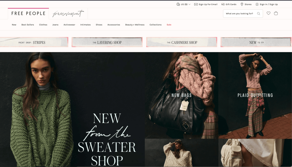
The same idea connects to the Gestalt principle of proximity, which explains that when objects are positioned close together, we tend to see them as belonging together. This can apply to a variety of elements on web pages. For instance, a website’s directory might use the same font and size across one line, making it easy for viewers to recognize that the words belong to the same section.

Similarly, think about when a clothing website shows you an outfit and links every item in it. You might have only clicked on the jeans, but suddenly the shirt, purse, and shoes are all right there too. Because everything is grouped together, it becomes easy to think, well, I could get the whole outfit.
Then, of course, there is usually an “Add All to Cart” button sitting right underneath.
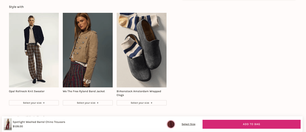
The design has made the decision easier, but it has also made buying more than you originally planned feel easier.
This idea of designing around how people experience a website is also discussed by Astriata in its article “How Multi-Sensory Web Design Can Improve the User Experience.” The article explains how visual elements can influence first impressions and how design choices can affect whether users continue scrolling, interact with a page, or click away. (Astriata)
But, Too Many Choices Can Be a Problem
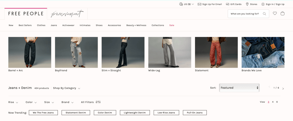
If I am shopping for a new pair of jeans, I might want to see 100 options so I can find the perfect pair. But after scrolling through 100 pairs of jeans, I might also just want to close the tab and forget about it.
This is known as choice overload. The Interaction Design Foundation discusses how having too many options can make decisions more difficult rather than easier. One example it discusses is the famous jam experiment, where shoppers were presented with either 24 varieties of jam or just 6. While the larger selection attracted more attention, shoppers who saw the smaller selection were much more likely to actually make a purchase. (Interaction Design Foundation)
This is where design can step in.
Instead of showing you everything at once, a website might organize products into categories, highlight certain items, or recommend what it thinks you might like.
In the context of jeans, you can now select if you want to look at the straight-leg, wide-leg, flare, low-rise, high-rise, or ripped section. Suddenly, you are not staring at 100 choices anymore. You’re looking at a much smaller group that feels easier to navigate.
So… What Are We Actually Choosing?
One of my favorite examples of this is subscription plans.
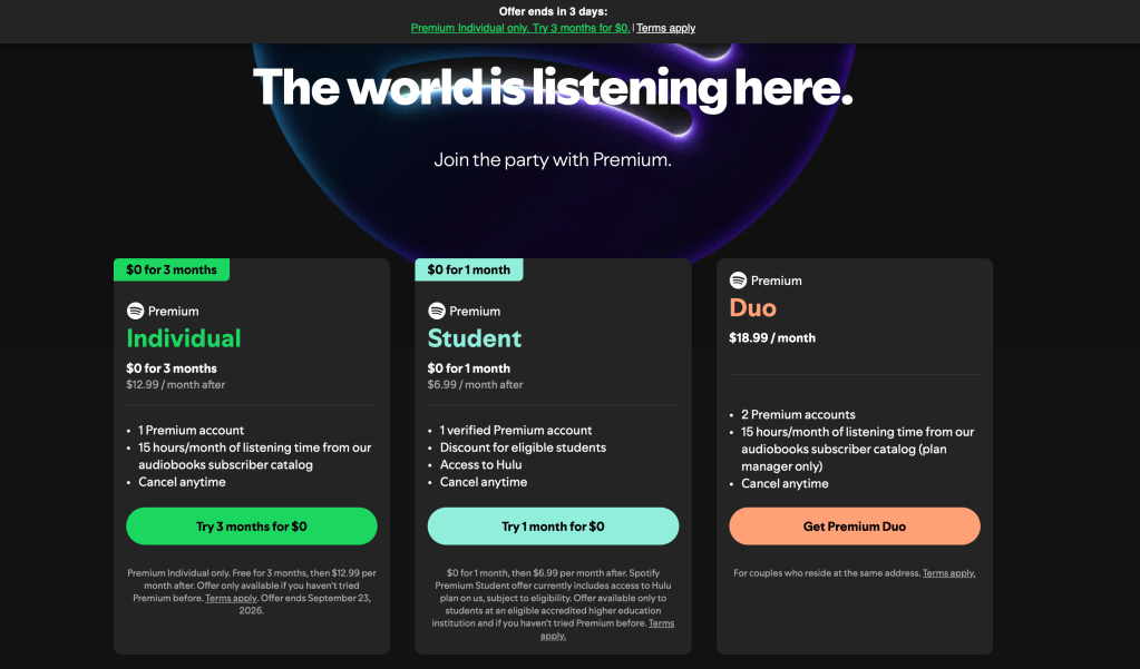
All three options are available. But which one catches your eye first?
This is an example of choice architecture, where choices are arranged and presented in a way that can influence how people interact with them.
To get to this part of the page, I had to scroll through an entire slide show presentation of all the benefits that come with a Spotfiy subscription, and when I finally got down to this part of the page, the student plan was beaming at me.
Research published in PNAS examined more than 200 studies and found that choice architecture interventions can influence behavior, although their effectiveness varies depending on the technique and situation. The researchers describe these interventions as ways of designing the environment in which people make choices while still allowing them to make the decision for themselves. (PNAS)
So, while Spotify is clever, and they clearly know their demographic, they are still giving us the choice between different options. We might notice that they use color to draw our eyes toward one option more than another, but at the end of the day, they still give us the ability to choose for ourselves.
Design Is More Powerful Than We Think
Behavioral economics has made me think differently about what good design actually means.
As designers, we have to work with the reality that humans are sometimes unpredictable. You never know what could turn away a customer online, so making a website accessible and easy to understand in a variety of ways is the safest decision.
But sometimes, taking advantage of how people behave can feel like we’re forcing the viewer to think a certain way.
That is where finding the balance becomes important.
A good website should be easy to navigate, shouldnt overwhelm us, and can guide us without feeling tricked.
 XIOMIDIA